Free60 vs Personal Dashboards
Personal dashboards built in Notion, spreadsheets, Gyroscope, or Exist.io aggregate data and display it. They are powerful, flexible, and passive. They show you numbers without telling you what is failing. Free60 is an opinionated diagnostic system with a defined model of structural failure. It knows which patterns matter and when a score is drifting toward a threshold.
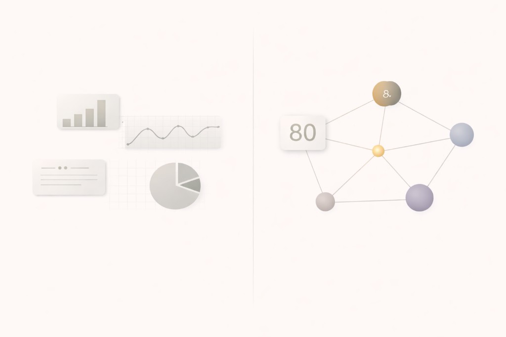
What do personal dashboards do well?
Personal dashboards are excellent aggregation tools. A well-built Notion "life OS" template can pull together fitness data, financial snapshots, project status, reading lists, and habit completions into a single view. Gyroscope connects wearable data, location history, and productivity metrics into visualizations. Exist.io correlates data streams to surface interesting patterns. Custom spreadsheets can calculate anything you define.
The strength of dashboards is flexibility. You choose the metrics. You design the layout. You decide what matters. For people who enjoy building and maintaining personal systems, dashboards provide exactly the level of control they want.
The weakness of dashboards is the same as their strength: everything is user-defined. The dashboard has no opinion about what matters. It displays whatever you feed it, with equal weight and zero judgment about whether a number is structurally meaningful or just noise.
What is the difference between aggregation and diagnosis?
Aggregation collects and displays data. Diagnosis interprets data against a framework and produces a verdict.
A personal dashboard can show you that your sleep averaged 6.4 hours last week, your spending was $3,200, your steps were 7,500 per day, and you meditated 4 times. Those are facts. They sit next to each other on your dashboard. The dashboard does not know whether 6.4 hours is a problem for you specifically, whether $3,200 is structurally concerning relative to your income, or whether the combination of declining sleep and increasing spending forms a pattern worth flagging.
Free60 applies a diagnostic framework to that same data. It calculates Sleep Consistency against a rolling baseline. It scores expense burn and structure against your income plan. It detects whether the combination of declining Health scores and increasing Wealth risk scores suggests a structural cascade. The system has a defined model of what failure looks like, and it measures against that model continuously. For a deeper look at what this system detects, see why tracking everything still leaves you without control.
Why does structure matter more than flexibility?
Flexibility is a feature when you are building a display. It becomes a liability when you need a consistent, reliable diagnosis.
A dashboard built in Notion requires constant curation. You decide which metrics to track, how to calculate them, what thresholds to set, and how to weight them against each other. If you make a mistake in any of those decisions, your dashboard gives you a false signal. If you stop maintaining it for two weeks because work gets intense, the data goes stale. The dashboard is only as good as your last update and your original design decisions.
Free60 removes those decisions from the user. Every KPI in the system has passed strict selection criteria: each must detect a real, standalone problem, require minimal effort to track, have consequences beyond itself, surface within weeks, and measure structural conditions rather than behavioral compliance. You do not choose which KPIs to include. The system has already determined which 26 indicators matter for structural stability.
This is a trade-off. You lose the ability to customize. You gain a validated, consistent diagnostic that does not degrade when you are too busy to maintain it.
What happens when the dashboard builder is also the dashboard user?
This is the hidden failure mode of personal dashboards. The person building the system is the same person the system is supposed to measure. That creates a structural bias. You design metrics that confirm what you already believe. You set thresholds you know you can meet. You weight dimensions you care about and underweight dimensions you are avoiding.
A personal dashboard rarely flags uncomfortable truths because the person who would be uncomfortable built the dashboard. The system is not adversarial enough. It shows you what you designed it to show, which is usually a version of reality that aligns with your existing self-image.
Free60 is externally defined. The KPIs, thresholds, scoring curves, and dimension weights are part of the framework, not user choices. If your spending structure is structurally concerning, the system flags it whether you designed it to or not. If boundary breaches are rising or buffer availability is collapsing, the KPIs detect it regardless of whether you would have included that metric in your personal dashboard. The diagnostic framework is independent of the user's preferences. That independence is what makes it a diagnostic rather than a mirror.
Does Free60 require the same maintenance as a dashboard?
No. Personal dashboards require ongoing maintenance: data entry, formula updates, layout adjustments, integration repairs when APIs change. The maintenance load is significant and grows with complexity. Many personal dashboards are abandoned not because the concept failed but because the upkeep exceeded the value.
Free60 automates most of its data collection through Apple Health (iOS) or Health Connect (Android). Sleep, activity, heart rate variability, resting heart rate, and other physiological markers flow in without manual entry. Manual KPIs (nutrition targets, financial snapshots, time allocation) require periodic updates, not daily maintenance. The diagnostic engine, scoring calculations, and pattern detection all run automatically.
The practical difference: a Notion dashboard might take 30 minutes per week to maintain. A spreadsheet might take an hour. Free60 requires a few minutes of periodic input for manual KPIs, and the rest runs itself. For professionals whose time is already constrained, that difference determines whether the system actually gets used.
What about tools like Gyroscope and Exist.io?
Gyroscope and Exist.io are more sophisticated than spreadsheets and Notion templates. Gyroscope creates polished visualizations from wearable and app data. Exist.io runs correlations to find patterns ("you sleep better on days you exercise"). These tools add intelligence to aggregation.
But they still lack an opinionated diagnostic model. Gyroscope shows you beautiful charts of your data. It does not tell you that your structural stability is degrading. Exist.io finds correlations. It does not determine whether a correlation represents a failure mode or a coincidence. Neither tool has a defined framework for what "stable" looks like across multiple life dimensions.
Free60 has that framework. The Freedom Index is not a visualization of your data. It is a structural assessment produced by 26 validated KPIs, each measuring a specific failure mode, aggregated through a defined hierarchy of levers and dimensions. The output is not "here is your data, make of it what you will." The output is "here is your structural state, here is what is degrading, and here is the risk."
Who should use a dashboard, and who needs a diagnostic?
If you enjoy building personal systems and have the time to maintain them, dashboards provide a level of customization that Free60 intentionally does not. If you want to track project progress, reading lists, workout programs, and personal goals in a unified view, a dashboard does that.
If what you need is a reliable, low-maintenance system that detects structural instability across your entire life and flags what is failing before it cascades, that is a diagnostic. Dashboards display data. Free60 diagnoses structural state. The two serve different needs at different levels of the system.
Common questions
Can Free60 replace my Notion dashboard?
Free60 is not a general-purpose dashboard. It does not display arbitrary data or let you build custom views. It runs a fixed diagnostic framework: 26 KPIs across 3 dimensions, scored automatically with defined thresholds and failure modes. If your Notion dashboard tracks tasks, projects, or notes, Free60 does not replace that. If your dashboard attempts to measure life stability, Free60 replaces the measurement layer with a rigorous, automated diagnostic.
Does Free60 let me add custom metrics?
No. Free60 uses a fixed framework of 26 KPIs that have each passed strict selection criteria: each must detect a real standalone problem, require minimal effort to track, have consequences beyond itself, surface within weeks, and measure structural conditions rather than behavioral compliance. Custom metrics bypass that validation. The value of the system is that every KPI has been vetted for structural relevance, not that it can display any number you choose.
FREE60 is available now on the App Store. 14-day free trial included.
Download on the App Store